Using the DatePicker control in Silverlight 5
This article introduces the DatePicker
control present in the Silverlight Toolkit and shows how to use it in
Silverlight applications.
The DatePicker control enables users to
select dates using a Calendar like interface. It also includes a TextBox as part
of its interface so that users can enter a date instead of selecting one from
the Calendar.
The DatePicker control is not part of the
Silverlight runtime, it is available in the Silverlight SDK. To use a control
from the Silverlight SDK, you must add a reference to the assembly and include
the appropriate XML namespace mapping in XAML.
For example,
xmlns:sdk="http://schemas.microsoft.com/winfx/2006/xaml/presentation/sdk"
Let us see how to use this control.
Create a new Silverlight 5 application
named SilverlightDemo.
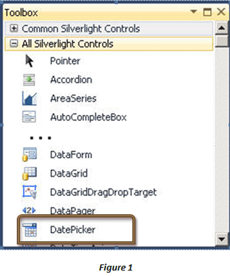
You can see the DatePicker control in the
Toolbox.

Add the DatePicker control from the
Toolbox into your application between the <Grid></Grid> tags.
The XAML markup will look as follows:
<UserControl
x:Class="SilverlightDemo.MainPage"
xmlns="http://schemas.microsoft.com/winfx/2006/xaml/presentation"
xmlns:x="http://schemas.microsoft.com/winfx/2006/xaml"
xmlns:d="http://schemas.microsoft.com/expression/blend/2008"
xmlns:mc="http://schemas.openxmlformats.org/markup-compatibility/2006"
mc:Ignorable="d"
xmlns:sdk="http://schemas.microsoft.com/winfx/2006/xaml/presentation/sdk"
HorizontalAlignment="Stretch"
VerticalAlignment="Stretch">
<Grid
x:Name="LayoutRoot"
Background="White">
<sdk:DatePicker
Height="23"
HorizontalAlignment="Left"
Margin="49,77,0,0"
Name="datePicker1"
VerticalAlignment="Top"
Width="120"
/>
</Grid>
</UserControl>
Save, build, and execute the application.
Click the calendar icon next to the Textbox in the DatePicker.
The output is shown in Figure 2.
![fig2.gif]()
The default date format of the The
DatePicker control is M/dd/yyyy. To change the format, you either use the
SelectedDateFormat property which allows one of two values: Long or Short, or
set the current culture of the thread to a new culture, which will also affect
the date format. You can also change number of properties of this control.
Figure 3 shows an example of some properties that are configured for the
control.
![fig3.gif]()
Add a TextBox and a Button control to the
page and configure the XAML markup as follows:
<UserControl
x:Class="SilverlightDemo.MainPage"
xmlns="http://schemas.microsoft.com/winfx/2006/xaml/presentation"
xmlns:x="http://schemas.microsoft.com/winfx/2006/xaml"
xmlns:d="http://schemas.microsoft.com/expression/blend/2008"
xmlns:mc="http://schemas.openxmlformats.org/markup-compatibility/2006"
mc:Ignorable="d"
xmlns:sdk="http://schemas.microsoft.com/winfx/2006/xaml/presentation/sdk"
HorizontalAlignment="Stretch"
VerticalAlignment="Stretch">
<Grid
x:Name="LayoutRoot"
Background="White">
<TextBox
x:Name="txtDate"
Height="20"
Margin="49,124,182,156"
Width="99"/>
<sdk:DatePicker
Height="23"
HorizontalAlignment="Left"
Margin="49,77,0,0"
Name="datePicker1"
VerticalAlignment="Top"
Width="120"
DisplayDateEnd="11/26/2012"
SelectionBackground="#FFE83333"
FontFamily="Georgia"
FontSize="14"
DisplayDateStart="{Binding
Text,
ElementName=txtDate,
Mode=TwoWay}"
/>
<Button
Height="25"
Margin="40,167,169,108"
Width="94"
Content="OK"/>
</Grid>
</UserControl>
This markup sets the start date, end
date, font style, selection background color, and binds the content of the text
box to the DatePicker. A sample output is shown in Figure 4:
![fig4.gif]()
Some of the commonly used properties of
the DatePicker control are:
|
Property |
Description |
|
BlackoutDates |
Retrieves or assigns a collection of dates that are blacked out or
unselectable |
|
CalendarStyle |
Retrieves or assigns the style that is used when rendering the calendar
|
|
DisplayDate |
Retrieves or assigns the date to be displayed |
|
DisplayDateEnd |
Retrieves or assigns the beginning date in the calendar |
|
DisplayDateStart |
Retrieves or assigns the end date in the calendar |
|
FirstDayOfWeek |
Retrieves or assigns the day that is considered the beginning of the
week |
|
IsDropDownOpen |
Retrieves or assigns a value that indicates whether the drop-down
Calendar is open or closed |
|
IsTodayHighlighted |
Retrieves or assigns a value that indicates whether the current date is
highlighted |
|
SelectedDate |
Retrieves or assigns the selected date |
|
SelectedDateFormat |
Retrieves or assigns the format that is used to display the selected
date |
|
SelectionBackground |
Retrieves or assigns the background used for selected dates |
Conclusion:
This article covered the DatePicker control in Silverlight 5.